My little page about South African Bulletin Board Systems doesn’t pull in many visitors.
This doesn’t surprise me in the least; a bunch of pages with tables and text about obsolete technology in some remote country is a little too, shall we say, “isolated”. It’s rather specialised. I’m well aware of this.
Imagine my surprise then when earlier this month it was exactly the obscure subject matter about an exotic country that the site got referenced by a syndicated article about early online communities and forerunners of the internet we take for granted today.
Go on, read the articles about a BBS that kept Serbians informed amidst dropping bombs and how Peter Gabriel is an unsung hero in the proliferation of early internet access.
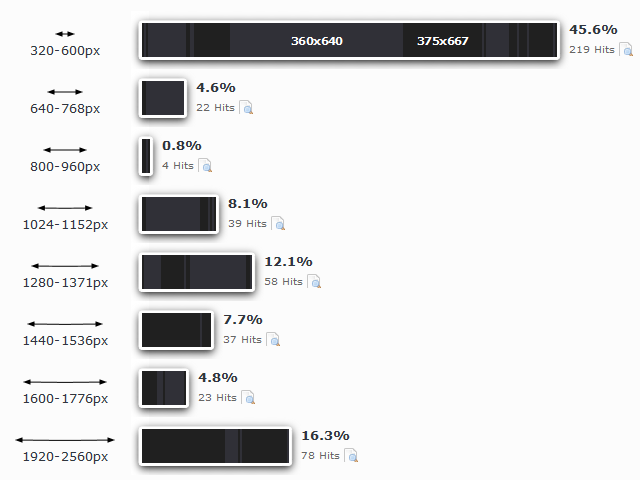
But what surprised me most about the influx of readers was the devices they used.

Almost half are mobile devices. Things have certainly changed in the last six years.

People are using mobiles to read these articles and any pages they link to.
As a result there’s a high bounce rate. My pages are not “mobile friendly”.
They don’t need to be, smartphone users are not the intended audience. Bing, Google and Yandex’s webmaster tools will tell you that sites may even be “penalised” for not being responsive although its content is not meant to be read on a 5-inch screen. SEO is fine and well but apparently lacking the intelligence to figure out what a site/page is about. It’s like we need meta tags to shoo away mobile users… go away, not for people with puny screens! This is going to be tl;dr for the likes of you. Too many words, no click bait here.

What I will not do is redesign my site to suit some pleb killing time waiting for the subway. Dedicated apps certainly have their place when you’re out and about – but they’re killing off the web in its wonderfully random form.
One wonders how many great sites get passed over because they’re not “mobile friendly”?
Image credits: Screen captures by hmvhDOTnet


